Saturday, February 27, 2010

Copic Colour Challenge #53 --- Yellow Green, Golden Yellow, Cool Gray No. 7

It looks like spring just might be around the corner --- I hope!  This week I saw a flock of robins and a red-winged blackbird, sure signs of warmer weather here in Missouri.  Add to that the sunny shades of yellow in this week's Copic Colour Challenge and the stage is set for walks in the country and birds coming to the feeders.
With spring comes April showers, and this little cutie and her friends by Mo Manning are enjoying every drop of the refreshing rain.

I used Basic Grey Origins DP which contains colors very similar to the challenge scheme.  I border punched one of the pieces with a new Martha Stewart extra wide punches, added some woven flowers from the Making Memories Chloe's Closet collection,  yellow Prima flowers, and a pewter charm.  I think "laugh" is a good sentiment for this card.

Thank you for stopping by! I hope you are enjoying your weekend and that wherever you are the weather is sunny and mild --- and warm!

Blog Signature

Friday, February 26, 2010

Mo's Digital Challenge #20 and a New (To Me) Technique

Do you ever see gorgeous coloring and just wish you could do that, too?  I am in awe of those who color with the distress inks.  Two of my many idols with the distress inks are Aija and Mina.  Talk about "Wow!" factor!

So when I started to think about a card for Mo's Digial Challenge I wanted to try coloring with a different media.  I have several Distress Ink pads, but not the refills (which would be easier to paint with, I'm sure).  Undaunted I moved forward, chosing the lovely image of Alice which I could do with the few colors I have.  Dawn's sketch was also perfect inspiration. 
And here is my card..........

I so love this illustration!!  The colors I used are Tattered Rose for her skin; Scattered Straw for her hair; Weathered Wood for her blue under dress; Antique Linen for her pinafore.  I used my water brush, keeping it fairly dry since I was taking ink straight off the pad.  It took several layers for the shading I wanted, but I really like the results.  I will be getting some of the refill bottles so I can get richer colores in future projects.  This doesn't mean I will abandon my Copics --- no way!  Just like Prismacolors, the distress inks are a very good accompiament for the Copics.  The papers are PaperTrey Ivory cardstock for the base card and the diamond cutouts.  The patterned paper is from the K&Company La Boutique collection.  I embossed the diamond shapes with Birds & Swirls folder from Cuttlebug and rubbed Brilliance Pearlescent Ice Blue in on the embossing and the edges of the papers.  Pretty blue and white pearls top it all off.  Here's a close-up of Alice:
Well, I am rushing off to Springfield with my mom for a long-overdue visit to Hobby Lobby!  Probably a stop at Barnes and Noble, too.  I'm suddenly in the mood to read the original story of Alice in Wonderland --- I only saw the Disney version years ago!

Thanks for stopping by.  I hope you have a grand weekend planned!

Blog Signature

Thursday, February 25, 2010

Whiff of Joy Challenge #68 -- Bev's Sketch and Inspiration from a Catalog

When you look at the beautiful bedding ensembles in the Penney's Home Sale catalogs do you think about how they would look in your home?  Or do you get inspiration for color schemes for cards?  If I had all the bedding ensembles that I have fallen in love with I'd have to own a hotel to display them all!  So I do the next best thing --- I save the pages and use them for inspiration for color schemes!  I did just that along with the great sketch for the Whiff of Joy Challenge #68.  Here is Bev's wonderful sketch for this week:
And here is my inspiration for the color scheme:
Isn't this pretty?  And here is my card.....
The beautiful Melinda looks so pretty in any color scheme, but I did this one in a partial monochromatic.  The Copic colors are:  E000, E00, E02 for her skin; E04, E11 for her hair; E13, E15, E17 for her dress; E31, E33, E35 for the underdress and pantaloons.  The DP is 7 Gypsies Savannah collection layered on a card blank made with Bazzill card stock.  The sentiment is a rub-on that I put on a card that came with the collection.  Flowers from Prima and pearls from my stash. 

I'm quite happy with this card and I hope you like it, too.  If you want to see some truly stunning cards, be sure to hop over to the WOJ challenge blog and see the DT's creations!

Thank you for stopping by!  I hope you are having a great week!
Blog Signature

Wednesday, February 24, 2010

Fresh Brewed Designs Blog Hop!!

Welcome to the Fresh Brewed Designs Blog Hop to celebrate the Hannah Belle and Tommy release.  Our lovely and talented Heather has been very busy adding new digital stamps.  If you saw my post on February 17 then you saw a sneak peek of one of the fun new images at FBD.

The hop is for today only and we have a fun game for you as you hop along, looking at the rest of the DT's terrific projects.  Each DT member has a special word on her post and when you put them all together you will see a time-honored little ditty that you are sure to recognize.  Collect all the words, then at the end of the hop email your results to Heather.  She will have her email in her post. 

If you arrived here from Jenn's blog then you are on the right track.  To start at the beginning I encourage you to hop over to see Callie

For the hop I have two cards featuring Tommy.  He is an adventurous little guy!!  First, you can find him out on the beach with his surf board.  Now, I'm a little jealous of Tommy today, because it is only 30 degrees here today and, even though I'm not a surfer, I sure would like to soak up the sun and bury my feet in warm sand! 

I colored the image with Copics.  This card needed to be really, really bright!  I used a 12x12 sheet of scrapbook paper, leaving enough to make a matching envelope.  The chipboard letters and the little flowers are from my stash.  I used the swirls embossing folder from Cuttlebug for the white paper.

-------------------
On the second card Tommy is exploring space! (I told you he was adventurous!) 

Again, the image is colored with Copics and I added some Copic Spica on the stars and planets.  The metallic hologram paper provides a lot of stars and sparkle and the card stock has flecks of white, giving it a deep space look.  The metal letters spelling "explore" are tags I've had for quite awhile.


Now I'm sure you would like to know what my special word is.  It is
a n d
Please head on over to Mary's blog to see her fab project and to pick up another special word.

Thank you so much for stopping by and leaving your comments!  I know you will enjoy the rest of the hop and don't forget to collect all the special words. 
Blog Signature

Monday, February 22, 2010

Copic Colour Challenge #52 --- Grey, Pink Green

This week's color combo for the Copic Colour Challenge is one of my favorites: 

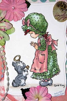
I love the simple joy in this Sarah Kay image.  The color combo is perfect for this, especially with the DP from the Basic Grey Two Scoops collection.  I do have to admit to a little bit of a goof-up in the colors.  Instead of the R11 Pale Cherry Pink, I accidently picked up the RV11 for the apron.  After the coloring was done I used the R11 over the apron anyway.  The results are still pretty.  The stunning flowers are new from Prima at Michael's.  Embellies are a string of white flat beads and a little sticker that says "Simple Joys". The left edge is punched with Martha Stewart, revealing a coordinating piece of the DP on the inside.

Thank you for stopping by!  I hope your week is off to a great start!

Blog Signature

Sunday, February 21, 2010

Sunday Sketch & Stamp Challenge #22 -- Sem's Sketch

Sunday Sketch & Stamp is back this week with a super sketch from Sem.  First, I want to thank everyone who participated in the last challenge.  I love browsing through the participants' blogs and seeing such creativity!

Here is Sem's sketch.  There were so many possibilities with this layout!  I can see it with lots of layers and colors or clean and simple.  I went with a combo of simple with lots of colors.........
I chose to use an image I already had colored and was looking for just the right presentation.  Sem to the rescue!  Here is Mo Manning's "Sumpin's Up" illustration.  Isn't he just adorable?  I remember my son trying to dress himself for the first time! 
 
This little guy is colored with Copics on PaperTrey white cardstock.  The patterned paper is from DCWV Nana's Kids collection.  The circles are Nestabilities die cuts and the brads are from Around the Block. 
 
I sure hope you join in during the next 2 weeks and show us your creation using this sketch.  I'll be hopping around and taking a look!

Thanks for stopping by!  I appreciate your time and comments.

Blog Signature

Friday, February 19, 2010

Mo's Digital Challenge #19 --- Clean & Simple

This is, indeed, my second post tonight!  I just couldn't wait to post this card!  Mo's Digital Challenge this week is "Clean & Simple", not an easy task for me! Here are the specifics:  white or cream card stock, the Mo Manning image of our choice, and a ribbon.  That's it!  What? No layers?? What will I do?  Hmmm.... how about the elegance of a wedding card?  Mo's "bride and groom" illustration is so exquisite that it doesn't need much more than a simple ribbon embellishment.  The beauty of digital stamps is positioning them on the card stock and getting the size I want, then printing in one step!

In this case I chose the ribbon first and matched the bustle on the bride's gown to the lavender butterflies on the ribbon.  I used Copics BV01 and V00 for the bustle.  The gown is lightly colored with E000 and E00.  My computer monitor is showing these hues to be much bolder than in actuality.  For example, the bride's hair is quite a bit lighter than I am seeing here.  But I did use Copic Spica glitter pens on her hair and bustle, which might be distorting the colors somewhat.  In any case, with a parchment liner this card will be put aside for the next wedding.  I think I might sneak a lavender butterfly embellie in the white area under the word "Wedding" later.  (grin)

Thank you for stopping by and for your kind comments.  I hope you have lots of love in your life!

Blog Signature

Whiff Of Joy Challenge #67 --- Pearls and Swirls

The Whiff of Joy challenge this week has me thinking elegance and movement --- Pearls and Swirls.  I had just purchased a package of Prima pearl scrolls and couldn't wait to use them.  This was the perfect project! 

Using a favorite image of Melinda with a basket of muffins (colored with Copics), I chose a bold DP from K&Company "Que Sera Sera" collection of double-sided card stock.  A simple column of brown CS punched with the new Martha Stewart lace punch runs under the image. Then swirls of pearls, topped with a single Prima flower.  Again I went out of my comfort zone with the colors, but I like the results. 
 
Because WOJ has a wonderful companion stamp of a basket of muffins, I placed that on the inside of the card.  
 

Leaving the card blank on the inside invites a more personal note, whether it be birthday or just a friendly thought. 

Well, it is Friday already and the weekend is here.  Thank you for taking time to stop by.  I hope you have some good quality time with family and friends this weekend --- that is when you're not blogging and creating!  :-)

Blog Signature

Thursday, February 18, 2010

Mo's Dream Team Guest Designer Post --- Plus Shanna

Mo Manning's illustrations have grown in popularity so quickly, and once I started collecting them I could see why!  They are fun and fabulous!  In fact, I have found that my own coloring skills have taken on a new dimension because of these images along with the inspiring projects from the design team.  I can color them for hours!  In fact, I have been the past few days! 

Every month Mo's Dream Team hosts a guest designer spot with a special sketch.  I would be thrilled to be in the same company as these talented ladies for a month!  So, yes!, I am submitting a card this month!  And here it is...............

As we enjoy a rare warm day here in the Missouri Ozarks thoughts naturally turn to getting back out on our many lakes and waterways.  Though I'm sure Old Man Winter has more surprises in store for us, this illustration called "It's Hot!" was good therapy for the winter blues.  I used Copics, my usual media, and added clear Copic Spica to the water for some sparkle.  The paper is from a stack of summertime prints by DCWV and I curled the edges for texture and definition.  The charms are a variety of jewelry charms I picked up at Walmart and the little flowers are from the Prima "milk jar" variety. Here's a close-up:
 
And here is the sketch.......

------------------
That's not all I have to show you today.  As I mentioned, I've been coloring a lot lately, so here is another Mo Manning illustration called "Sorry Shanna".  Oh, she just looks so apologetic with the pretty tulips as a peace offering! This is one of those "Aawwww" moments!

I selected just a few Copics in the lavender wedge on the color wheel.  Basically, I used V000, V01 and V12 for her dress.  Her hair is YR21 and Y21; skin E000 and  E00; Boots E33 and E35; grass and leaves YG17 and YG23.  The paper is from a brand new packet of DCWV Latte matstack.  The border is a new Martha Stewart punch.  The flowers and embellies are from my stash and I think the lace is from one of my antique treasure hunts.  I'm not much of a "purple" person, but I do like this collection of papers. 

This is a long post and I appreciate your browsing all the way to the end!  Thanks for stopping by, and wish me luck in the guest designer call!  In any case, I have many more colored illustrations to put on cards, so I hope you come back for a look!

Blog Signature

Wednesday, February 17, 2010

Two Trios: News of an Upcoming Blog Hop and a Change of Pace

Tonight I have two, yet very different trios in post.  The first is a brand new image from Fresh Brewed Designs.  In fact, it is so new it isn't even available yet, but it will be on February 24.  That just happens to be the day of the Hannah Belle and Tommy Blog Hop, introducing this image and many more!  My friend and fellow Busy Beauty, Heather, is the artistic talent at FBD and I am honored to be joining her team to roll out the new release.  How about a sneak peek at Hannah Belle and Friends?

This adorable trio are not only cute, but they are best friends.  As the sentiment indicates, they share --- secrets, clothes, encouragement, but never,ever boyfriends!  Thinking back to my high school days (hey! not that far back!) I was part of a trio much like these girls and we were "tight", as they say. 

Be sure to come back for the blog hop on February 24.  There will be fun and prizes!

------------------------

Now for a change of pace.  Though I usually show cards with images colored in Copics, I do love vintage and retro graphics.  I have found, too, that many of my potential customers are looking for simple but unique note cards. Before I get to the cards I have to send big hugs to Chrissie.  She has introduced me to so many new adventures in cardmaking, including Joanna Sheen. If you visit her blog you will love her and her talent as much as I do!  Here is a trio of simple note cards featuring Joanna Sheen artwork on CD rom.


These seaside English gardens look so elegant and peaceful.  What a lovely place to sit and dream.  On each card I placed a small vellum envelope.  These were from a Hot Off the Press booklet I bought years ago!  The border is a Martha Stewart punch and the background papers are from my scrap bin.  

There are my two trios for today!  Thank you for stopping by and I hope to see you again!  There's so much more to come! 

Blog Signature

Tuesday, February 16, 2010

My Studio Is Warmed Up and A Snowman Is Ready for Bah! Humbug!

Yep, that's my fireplace and, yep, the propane flames are warming up the ceramic logs and my studio is toasty warm again.  Aaahhh.... nothing like roughing it! ;)


So, what's my first project now that I have heat again?  I build a snowman!  Actually, this snowman won't melt and is happily chatting with a little cardinal.  This card is for this week's Bah! Humbug! challenge theme "Snowmen".  The illustration is by Mo Manning --- love her art!--- and is colored with Copics.  The easel card is constructed with DP from Basic Grey's Mistletoe and Pear Christmas collection from a couple of years ago.  I love using the snowballs that I found at Hobby Lobby, especially for the "doorstop" of the easel.  The only other accent is the satin rick rack ribbon that I found in a Christmas shop in Amana, Iowa. 

Lately I have seen many snowmen in front yards, sometimes entire snow families.  The snow is nearly all melted now, as are they, but I have a feeling more snow is on the way.  Well, it certainly keeps me in the Christmas mood!  Many thanks to the great ladies at Bah! Humbug!  They are fun and talented --- hop on over and see for yourself!

I'm sure glad you hopped onto my blog today!  I hope your week is going well.  And to all the athletes at the Vancouver Olympics, good luck to the competitors and congratulations to the winners.  It's all so exciting!

Blog Signature

Monday, February 15, 2010

Fingers --- Frozen --- Can't type --- Can't create --- AARRGGHHH!

Just a quick "Hello" to everyone and hope you all had a loverly Valentine's Day.  It is so cold here --- again!  Until I get more propane for the fireplace in my studio my creativity and blogging is frozen.  I think I'll go back and stand in front of my coffee pot --- at least it is warm!


Blog Signature