Saturday, September 17, 2011

Sassy Cheryl Challenge -- Something Good to Eat!

Today is cold and rainy -- brrrr!  A perfect day for a frothy latte or a hot cocoa topped with whipped cream. This fits in well with Sassy Cheryl's challenge this week - Show Us Something Good to Eat! 


 It isn't quite cold enough for snow, but Cheryl's Snowmen are always welcome here, especially when serving up a luscious latte!  I used fun dp from the DCWV Belle Cafe stack, one of my favorites.  The lovely die cut, that is nearly all hidden is actually from the Cricut cartridge "Elegant Edges".  I just bought this cartridge (on sale at Michael's for $29.99 -- saved $60!! Woo Hoo!)  I have a feeling the cartridge will get quite a work out!  Loads of designs that can be frames, elongated, and even borders. The bow is from ribbon edged organza and I learned the double bow technique from Jak Heath's tutorial.  She is always generously sharing her skills and creativity.  This was actually very simple! 


 I colored the image with Copics and used Liquid Pearls for the froth on the latte and the top of his hat. 

Inside is a plain yellow space for a personal note and a scrap of the dp for a border.  The swirl at the top is the cut out from the die cut on the front of the card.  I'm trying to get into the habit of doing the inside of the cards with scraps as I go along.  It's so tempting to just finish the front but the inside can be just as fun!

I also want to give credit for the sketch to The Deconstructed Sketch and will enter this card in their challenge as well.

Thanks for stopping by today.  I hope you are enjoying your weekend, whether it is cold and rainy or warm and sunny. 

Friday, September 16, 2011

Bah! Humbug! Challenge --- Flourishes and Swirls

Flourishes and swirls and dizzyingly creative projects.... that is the theme at Bah! Humbug! this week.  Who doesn't love beautiful soft swirls and flourishes?  They add motion to a project and, in the card I made, lots of motion! 

I started with patterned paper from a stack I've had on hand for years! It is Slab XI by Provocraft and has a variety of swirling patterns in several color combos.  This piece was perfect for the image, which I had already colored.  This adorable image is Teen Fairy Pia, new at Mo's Digital Pencil.  She is colored with Copics (yep, I actually remembered to write down the numbers!):
Hair -- W00, W1, W3
Skin -- E00 and E000
Dress and wings: -- R20, R22, R27, R29, R11, R00, YG61, YG67


The card base is pink Bazzill card stock, which I also used for the pink and green swirls. These were cut on the Cricut using the Home Decor cartridge.  More green Bazzill die cut with my Nesties backs up the image also cut with the Nesties. The poinsettias are Recollections by Michael's.  A fairy this magical deserves some sparkly pixie dust so I added the rhinestones to the swirls.

Here us a close up of Pia.  She has a sister named Mia, too!

Now it's your turn to put your creativity in motion with swirls and flourishes!  Remember, you don't have to make a card.  Any Christmas project will do!  And the more the merrier!
  
The deadline for this challenge is 
12 noon (UK time)
Thursday 22th September 2011


If you like my project (and even if you don't -- heehee) hop over to Bah! Humbug! for inspiration from the DT and the participants.  You'll be swirling with excitement!  Ok, now I'm getting dizzy.

Monday, September 12, 2011

Mo's Digital Pencil Challenge #99 --- Boy Attitude

Ok, girls.... admit it. "Boy attitude" in the form of

tall
dark
and
sultry

still brings on palpitations, sweats, and hot flashes.  No, honey, that is NOT menopause.  It is


I couldn't wait to get this hunk colored and placed on a card --- or something!
He is colored with Copics so I could get deep colors and depth.  I added accent outlines here and there with Copic black multiliner 0.5 for additional sharpness.  That effect really worked for me and I see more of it in my future!


So I made a card (of course).  This is probably the most unusual card I have ever concocted, and it was A BLAST!  I let myself go with a dark, grundgy look, using papers and embellies I've had on hand for a very long time.  The patterned papers came from Paper Pizzazz collections.  Brown and black Bazzill card stock for the card base and backgrounds.  I have several pieces of the suede cording from other projects and the bar brads are from Karen Foster Designs.  It took a long time before just the right project came along for the bar brads. The stick-on square and round brads are K & Co. The image is cut with Nesties diamond dies and placed askew (love that word -- askew).  There is just enough dark grey chalk rubbed on to dirty up the white space.


Inside the card are more of the asymetrical shapes mirroring the front of the card.  The image comes with a great sentiment, but I opted for this one, as it better suited the purpose for this card.  The black card stock is embossed with the Tim Holtz  brick embossing folder.  A close up of the photo will show that.

Like I said, I had a blast putting this card together!  It's sort of like the rare times that, as a little girl, I chose to make mud pies outside rather than bake cookies in the kitchen.  Now, I still don't like to get my hands dirty, and I rarely bake cookies, but letting my imagination get a little "dirty" at times is as much fun as, well, mudpies! 

Thanks for stopping by.  Now for more "boy attitude" hop on over to Mo's DP2 Challenge and join in on the fun. 


Sunday, September 11, 2011

Sassy Cheryl Challenge #80 -- Wrap It, Bag It, Box It!

It has been awhile since I've been able to participate in Sassy Cheryl's weekly challenge, so it is especially fun to be back for this one.  I am so used to making cards that this week's challenge -- Wrap It, Bag It, Box It --- made me think outside the box, ironically.

I do a lot of photography and often give CDs of the images to those in the pictures.  It is fun to create the CD labels.  This challenge made me think of a special CD jewel case for the photos of the spooky Halloween goblins.


The images used here are Sassy Cheryl's "A Witch and a Frog".   She is really too cute to be a wicked witch, but I'm not so sure about that frog!  This creepy tree is actually from Tiddly Inks.  I love the twisted trunk and it made the perfect background for this little scene.  The bats are cut with the Cricut  and can be found in the Paper Doll Dress Up cartridge.  The label on the side of the jewel case was computer generated.


The tree and the witch were colored with Copics.  The background is various shades of blue, lavender, yellow, and pink chalks from Stampin' Up.  I applied the chalk with Q-tips.


The whole scene was trimmed up with bat wing craft scissors and mounted on black card stock.

I really like this project, even though I don't have little goblins to take photos of.  But then, my little grandniece and grandnephews will probably cast some spooky spells on their neighbors. 

Thank you for stopping by!  For much more inspiration from the DT, hop on over to Sassy Cheryl's Challenge.  You won't be disappointed!

Friday, September 9, 2011

Bah! Humbug! Challenge 36 --- Paper Weaving

Yet again the ladies at Bah! Humbug! present an opportunity to stretch our creativity! The theme this week is "Paper Piecing" so I chose Iris Folding as my interpretation.  This technique has been around for a long time but I just never sat down to tackle it until now. 


It's kind of risky to try a new technique while I am honored to be the Guest Designer at Humbug Hall this month.  I'm hoping that this first attempt doesn't land me in the moat!  Actually, no worries there.  Ann and Max are the most gracious crafters and LOVE to see everyone's creativity. So, jump on in --- not into the moat! --- and try out your paper weaving technique! You will definitely be rewarded with comments and kudos! Just leave a comment at Bah! Humbug! with a link to your post
.
The deadline for this challenge is
12 noon (UK time)
Thursday 15th September 2011
We'll be around to visit and soak in all the inspiration from your projects!  Have a wonderful week and --- HAPPY CRAFTING! 

Monday, September 5, 2011

For My Aunt's 90th Birthday

On September 7, 1921, Lorraine Quinn was born in South Dakota.  Ninety years later she just recently celebrated 70 years of marriage with my uncle, Earl Anderson and the 55th birthday of their son Larry.  In two days my mom and I will be in Iowa to celebrate the 90 years of this wonderful lady's life.  She has been like a second mother to me so I often call her Aunt Mom. 

I wanted a very special card for her, something vintage and loaded with beautiful things.  Lorraine is probably my biggest fan when it comes to my cards and often keeps them sitting out for months.  I hope this one sits out for many more years to come.


First I have to thank Louise at Bumble Button for sharing so many exquisite vintage photos and images! This image came from a Jane Austen era post she did a few months ago. Though the era is before Aunt Lorraine, this beautiful face reminds me of her as I see her in early photos.  Also, there are so many goodies on this card, many of them pieces I've had in my embellies stash for a long time.  I found the crocheted lace in an antique store. Often my cards have lots of layers and fancies, but I think this might just be over the top for me.

 I have to give credit to a very talented cardmaker for the layout and inspiration, however, I forgot to write down the blog name.  If you recognize this layout please accept my thanks for the inspiration and my apology for not giving you proper credit.  When I saw it I knew it would be perfect for this occasion.   

Thanks for letting me share this with you.

Happy birthday, Aunt Lorraine!

Friday, September 2, 2011

Bah! Humbug! Challenge --- Text or Sentiment

I am so excited! For the month of September I am a Guest Designer at Bah! Humbug!  I found this blog last year and fell in love!  They have so many fun and inspiring challenges every week.  I found Max, Ann and Irene to be very special --- and funny --- ladies who I would love meet for a cup of coffee -- or tea!  

This week the challenge is "Text or Sentiment".   I always admire cards that use a sentiment as the focal point so this challenge gave me the opportunity to make one for Christmas.  The simplicity of computer generated sentiments will make this a favorite for the coming holiday season.  


This card has a lot of bling, too.  The background is a beautiful aqua glitter paper.  I used two sizes of the Nestabilities Curved Rectangles in aqua card stock and a pretty snowflake dp.  The sentiment is cut out with the Nestabilities Labels 4.  The bling behind the sentiment are curved rhinestone stickons and glittered stems from a floral arrangement.  The bling on the sentiment is part of a stickon flourish.  I like how it turned out and hope you do, too. 

Now, it is time for you to showcase one of your favorite sentiments, verses, or other text.  It doesn't have to be a card.  In fact, we love to see all sorts of projects!  And we'd like you to put your link in a comment over at Bah! Humbug!  

The deadline for this challenge is 
12 noon (UK time)
Thursday 8th September 2011

I'll be around all week to see your creations and I am looking forward to every single one!

Tuesday, August 30, 2011

Animal Tales

To illustrate what I have been doing the past few days --- in other words, why I haven't posted --- here is the story in some photos I took over the weekend.

Friday I drove to Omaha to see the newlyweds, who are head-over-heels in love.

Saturday we spent a few hours at the Henry Doorly Zoo to see what we could see.

Mostly we saw the animals sleeping in the sun. This big guy was so relaxed his tongue was hanging out.

Sunday we were the lazy ones, napping and taking it easy.

Monday I drove home, having to take a longer route due to flooding on I-29 in Iowa and Missouri. 

Today I set up my new computer, occasionally butting heads with the new technology.

But mostly I did the happy dance when the appropriate lights clicked, motors started whirring, and the internet came alive again. 

I have a lot of files to put back in order, but took time to take a peek at favorite blogs and facebook.

Tonight I took time to watch America's Got Talent.

Tomorrow I have an appointment to get my hair done.  What do you think, time for a new look?

But, seriously, it is time to stop hanging around and get some cards made and more photos posted!

All of these photos were taken at the Henry Doorly Zoo in Omaha, Nebraska.  And, yes, there are LOTS more of them!

Thanks for stopping by! See you again soon!

Wednesday, August 24, 2011

For Rhonda 1960-2011

This card has been in my draft posts for several weeks, but it has been difficult to decide to publish it. I don't know why.  Maybe because I had to let more time pass.  A wonderful woman and great friend, not to mention a genius hair stylist, passed away on July 23, 2011, after a 6-year battle with breast cancer.

Rhonda was one of the first people I met after moving to Branson four years ago.  After all, a girl needs her hair taken first and foremost, right?  Rhonda would agree with that!  She welcomed me to her chair like an old friend and took care of me from that first visit.  Being nearly a native of the area she knew what it was like to actually live here in Branson, not just to come in as a seasonal visitor.  It was her hometown friendliness that helped me to make the transition from the big city.  She, too, was a military mom and we talked of our sons' experiences.  As a very active participant and leader of the local chapter of Relay for Life, just weeks before her death, Rhonda made sure she was there cheering everyone on.  At 51 years young this amazing woman showed courage, love of friends and family, and faith --- above all faith --- right up to the moment she began her new life in Heaven.
Rhonda loved butterflies so I made this card so symbolize her dazzling life and rise to Heaven.  Oh, dear God, how I miss her!  But when I was struggling with my hair before my son's wedding I just called out -- Rhonda, take over for me!  Suddenly I was doing things with my hair I could never do before.  She was there!  She loved doing hair and make up, helping people to look good. 

Thank you dear friend!  I miss you!

Saturday, August 20, 2011

Bah! Humbug! Challenge #33 --- Something New

** This is my second post today. For the DP2 Challenge just scroll down a bit!  Thanks!**

The ladies at Humbug Hall might be checking their calendars to see where the week went!  You see, I have a bad habit of slipping my entry in at the last minute lately.  But here it is only Saturday night (US time) and my card is done and posted! So girls, you've not fallen into a deep sleep for five days --- I really did get it done already!  You see, the challenge this week is "Something New" and I have a new set of "Delicate Doilies" stamps from Stampin' Up that I just got and couldn't wait to ink up!

This is just about as clean and simple as I can get.  I used three of the four doilies, the larger one with embossing glitter. I added more glitz in the large doily with clear rhinestones and circled the smaller ones with matching stones.

This shows the glitter embossing a bit better.

The sentiment is a stamp I have in my stash and is embossed with cloisonne powder.  I had to look up that word to see what color it really is, but the only thing I found was that cloisonne is a glaze or paint.  Oh, well, close up it is more than one color, sort of iridescent. 

So, there you have it! My Bah! Humbug! card done early. If I keep this up maybe I'll get caught up on my stash of Christmas cards.  After all, it is August already!  Now, hop on over to Bah! Humbug! and see what's new there.

Mo Manning DP2 Challenge #96 --- Feeling Blue

Blue is my favorite color so when Debbie, this week's hostess over at Mo Manning's DP2 Challenge chose "Feeling Blue" as the theme I knew just what I was going to use.  I've had this cute Easter Bunny image colored for months. Yes, it is an Easter image, obvious by the colored eggs on the ground, but absent those it could be any little girl clinging tightly to her pet rabbit. 

I've always loved navy blue and white together so I couldn't wait to get this card made up.  I used speckled blue card stock for the base, pretty blue roses dp cut with the large scallops Nesties die, a scrap of lace and polka dot ribbon. Add to that paper roses and a pearl swirl.

The image is colored with Copics and cut with the Nesties square die.Now to wait till Easter to send this to a special little girl!  That seems such a long way off!

Thanks for stopping by today.  I hope your weekend is all you want it to be, especially cooler!  Be sure to hop over to the DP2 Challenge to see the fabulous projects by the design team.  Remember, they are "Feeling Blue" so leave them lots of love, too!

Wednesday, August 17, 2011

Wedding Photos --- Cakes and Toasts

I posted more photos from Paula and Scott's wedding on my other blog The Oyster's Pearl. These are of the cakes and toasts.  Thanks for stopping by!

D.I.V.A.S. OBG Blog Hop!

It's time for a blog hop!


After a brief summer break we are back on the third Wednesday of the month with the Design D.I.V.A.S. Oldies But Goodies blog hop.  This is when we use neglected and forgotten items from our stashes.  The Design D.I.V.A.S. is a private Facebook group, which is a branch of the Original Design D.I.V.A.S. on the Splitcoaststampers website. The acronym for the D.I.V.A.S is, Divine, Inspirational, Virtuous, Artistic (or annointed) Sistahs. This is a very talented and supportive group, which I'm blessed to be a part of .  If you came here from the uber-talented Cindy's blog you are on the right track.  She is a tough act to follow and I am honored to be in her company! To start at the beginning of the hop pop on over to see what our amazing Heather has put together.

My "Oldie But Goodie" was discovered while I was reorganizing one corner of my studio. I opened a drawer and found a package of these pretty blue library card pockets! I have know idea what I bought them for, but now one of them is the centerpiece of this thank you card. The front of the card is in four sections and covered with four pieces of dp from a 7 Gypsies stack, which I haven't used in forever! The sentiment tag is also from that stack and I put a rub on "thank you".  The inside tag was also found in that neglected drawer, along with about 49 others in a package of tags. Don't ask cuz I don't know. How do we accumulate all this stuff?  The butterfly isn't all that old and came from a K & Co set of 3D stickers.


It might be a pain in the you-know-what, but reorganizing now and then is like shopping all over again!  Now, hop on over to Maria's and see what treasure she has made from her OBG stash!

Thanks for stopping by and enjoy the hop!

Tuesday, August 16, 2011

Bah! Humbug! Challenge 32 --- "Kiss"mas!

The ladies at Bah! Humbug! have a knack for creative challenges.  This week it is all about "Kiss"mas and, honestly, what is Christmas without KISSES?  There's mommy kissing Santa Claus, kissing under the mistletoe, and, yes, kissing dear old Aunt Gertrude!

My card is all about "Cooooool" kisses as Siku and Shiya by Mo Manning share an Eskimo kiss. 

I kept it all pretty simple, focusing mostly on the image. The beautiful paisley dp is by The Paper Studio, the rhinestone circles by Recollections at Michael's, and the bow made from ribbon in my stash. (This is the last of this roll of ribbon and I don't know what I will do without it!)

These cuties are colored with Copics.  The blues are B91, B93, B95 and B 99. The browns are E49, E71 and E77.  The fur on the blue parka is colored with Cool ("C") neutrals; the brown with Warm ("W") neutrals. And the image is cut with the Nesties circle die.

Inside is more of the paisley dp with blue card stock for a personal note. The rhinestone arc is the leftover from one on the front of the card.

Thanks for stopping by and be sure to visit Bah! Humbug! to see more "Kiss"mas ideas.  Believe me, they are really coooooool --- and HOT!

Friday, August 12, 2011

More of Paula and Scott's Wedding........

........ HERE.  I have reopened my blog "The Oyster's Pearl" where I will be putting photos and stories of the wedding.

Wednesday, August 10, 2011

Endless Reorganizing

It seems I am constantly reorganizing my studio! One set up will work for awhile, then becomes hard to manage. Or I need a spot for something, but something else is already there.  A challenge I've had for awhile is keeping my rubber and clear stamps where I can easily see them and, thus, use them!  I do use digital images a lot, but I often find "touch and feel" stamps that I just have to have.  I set up an area just for stamping, but it became covered with new stamps that I left out so I wouldn't forget to use them.  Then my stamp area dwindled to a small patch barely large enough for an ink pad, piece of paper and the stamp!  As much as I would love to have those lovely narrow shelves to display -- and SEE -- the stamps I have, there just isn't that much wall space in my studio.  Well, not yet, but that's a plan for another day.

Take the stamp dilemna and add to it unruly ribbon bins and a solution began to emerge.  Hmmm......

This is the area in question and I have already begun the transition.  On the left is a pegboard full of ribbon, some in bins and some on hooks.  Below the ribbon (a better picture is below) is my stamping area.  On the right side of the picture above is a pegboard full of adhesives, stickers, embellishments, and decorative scissors.  Below that are two CD/DVD shelf units that I've been using for some of my clear stamps that are stored in CD jewel cases and other tools. 

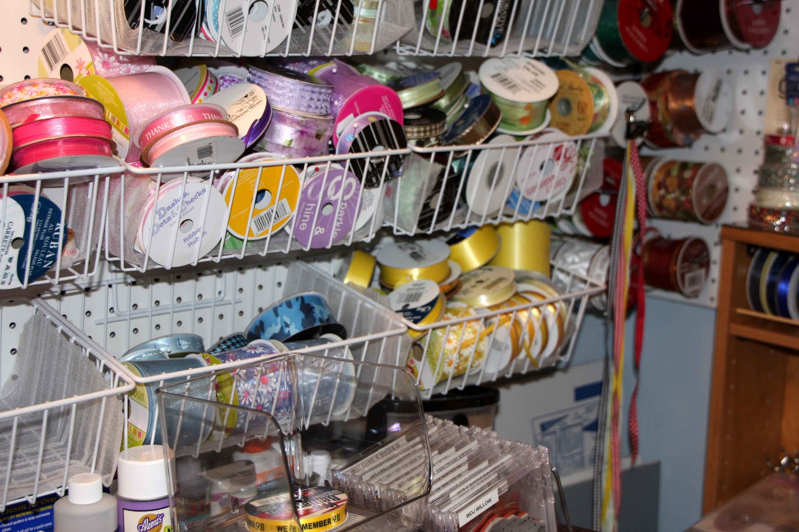
The ribbons are sorted by color, but not convenient for finding specific widths or patterns.  The wire bins had to be lined with thin foam sheets to keep the spools from rolling out.

Here I have moved some of the ribbon to the CD/DVD shelves.  The cool thing about adjustable shelves is that there are lots holes drilled already.  To keep the spools from rolling off these shelves I have inserted narrow dowels into the open holes above the shelf.  This gives a railing about 1/2" above the shelf, just enough to act as a guard.  I have some sticky measuring tape to put on the edge of some of the shelves so I can measure at the shelf and not find myself with a stack of spools at my work space.

Now, here is the stamping area.  Believe me, there is a stamping pad and cleaning pad under all of this!  When the bins are empty of ribbon I will have my jewel cases of clear stamps in them.  You can see a few of them on the left behind the little wooden box.  The cabinet under all the stuff, is a Sears Craftsman that is one of my favorite organizers.  The top has a flat wooden work area.  It also has a built in electrical strip which is really convenient for the heat and glue guns.  The sides are also punched for pegboard hooks.  The five drawers vary in depth from quite shallow (perfect for tools like scissors and exacto knives) to deeper for larger items like spray cans .

This bin unit is from Ikea and perfect for segmented organizing.  I've been cleaning this out, too.  But for now my focus is on the boxes on top. These are full of wood mounted rubber stamps.  Even though the boxes are marked by brand or holiday or other categories, I usually don't bother getting them out because the top of the unit is 5 feet high and I am barely 5 foot 3, so I've often had them dumping on my head. Some of the wood mounted stamps might soon find themselves converted to cling, which will make them easier to store.  Other stamps might find themselves on Ebay. 

As you can see, I am far from finished with this project, but at least I have a plan that will work ---- until I get another bug to reorganize!  Thanks for stopping by.  Hopefully I've passed on some ideas.  Please leave a comment with your favorite storage and organizing ideas.

Bah! Humbug! Challenge--- White on White

Those of us who love Bah! Humbug! have  two more reasons this month to be excited! Along with Ladies Humbug, Ann and Max, we have guest designers Donna and Tracy for even more inspiration and awesomeness. 

I've followed Donna on her blog Popsicle Toes for a couple of years. She provides constant inspiration and lately I've dusted off my Cricut because she just makes it look so much fun!  This card is dedicated to Donna, the Guru of die cut layers. I call my project "White on White, Take 2".

The card really is white, well a shimmery pearl white, made from 80# report cover stock. I love this paper for its weight and rich feel.  All parts of the card are from the same paper. We are having a cloudy, rainy day so my natural light for photographing is a bit more dull than normal.

The die cuts are from the Damask Decor cart which has so many gorgeous designs.  This one is the snowflake.  Now, here is why I call this "White on White, Take 2".  Take 1 was an absolute disaster!  Let's just say that intricate dies cuts + Xyron adhesive + acetate = absolute disaster!  I like to make sure that the pieces are going to stick so I put the die cut through the Xyron.  Well, there is always sticky stuff that doesn't stay on the backing but I can usually clean up the residue with a soft eraser.  That does not work on acetate!  What a mess!  So, I cut out another piece and dotted it with the mini glue dots.  Ahh! Much better and the die cut isn't going to come off.

The shadow layer for the snowflake is attached to the card base with the acetate over it.  There is actually a third layer: a matching snowflake die cut in the center.  I didn't pop it up as much as I should have -- and I was NOT going to go for Take 3 --- so I turned up the corners a bit.  All came beautifully together with the pearls. 

Albeit this is white on white, I would not call it CAS!  But, truthfully, I can't wait to use more of the gorgeous damask pieces on this cart.  Thanks for taking a look and be sure to pop on over to Bah! Humbug! for more inspiration. 

Sunday, August 7, 2011

Wedding Card For Paula and Scott


Yes, I do have a card to post today! It is the wedding card I made for Scott and Paula. It's quite different than my usual cards in that it doesn't have a stamped image nor are there a lot of layers.  This is pretty close to CAS for me.  Paula's colors were royal blue and antique gold which was very easy for me to work with as blue is my favorite color, too.  And the rhinestone swirl with the blue stones was my inspiration for this card.

The sentiment is computer generated. 

The inside of the card has a personal message as well as this lovely verse:

The Blessing of the Apaches

Now you will feel no rain
For each of you will be shelter to the other.
Now you will feel no cold
For each of you will be warmth to the other.
Now there is no more loneliness for you
For each of you will be companion to the other.
Now you are two bodies
But there is only one life before you.
Go now to your dwelling place
To enter into the days of your togetherness
And may your days be good and long upon the earth.

I found this in The Ultimate Guide to the Perfect Card, 2nd edition

It looks like the squelching heat of the past few weeks will begin to subside here in southern Missouri, with the likelihood of rain, too! I certainly hope so. I hope your week goes well and full of blessings!

Friday, August 5, 2011

Arch of Swords

Here it is one week since my son's wedding and I've posted only one photo! Shame on me! Actually, after getting back home on Saturday I was so tired I slept most of Sunday. Then on Monday I popped something in my lower back and couldn't move without assistance for two days. Sitting at the computer was out of the question. Since then my back is getting better, but still uncomfortable.  At least I finally loaded and edited the photos I did take last week.

Most of the photos I took were at the reception, leaving the wedding pictures to Rebeca Peters of Kansas City. She is a fantastic photographer and I can't wait to see all the wedding party and family photos. Since Scott and Paula are still on their honeymoon we have gotten only a sneak peek at Rebecca's work. But I did get some very nice shots of the Wedding Arch of Swords. This military ceremony, steeped in tradition is sure to bring tears, cheers, and a giggle or two. Scott's swordsmen are officers he has worked with during his career.  They also served as ushers for the families and friends attending the wedding.

Here are some of the stills of the ceremony:

This is at the third pair of swords, but at each of the first two the swords were lowered and the command called out "The price of passage is one kiss!" to which Scott and Paula shared a quick kiss.

At the third pair the same command was called out, but one quick kiss wasn't enough. The command "A REAL kiss!" was called out, to which Scott and Paula complied with a kiss more, um, interactive than the one pictured above!

If the swordsmen were supposed to remain stone-faced during this, they certainly didn't at this point!

The tradition of the Arch of Swords is to symbolize safe passage for the couple into their new life together.

But the best part of the ceremony was when the swordsman, in this case Captain Studeman on the left, gently whacked the bride on the behind with his sword and said "Welcome to the Navy, Mrs. Moseman!"  I didn't catch the actual sword-whacking, but love her expression as they passed through.  My brother took a video with his phone and is trying to figure out how to get it into the computer. I'm looking forward to the replays!

I'll have more photos of the reception over the next few days, but will probably put those on one of my other blogs.  I want to get back to making some cards and posting them here.  But, don't worry, I will let you know where to find more photos and stories as I get them posted.

Have a great weekend, everyone! Thanks for stopping by!